INOTHERM
UX/UI redesign of the new configurator for the design of the front door
While working with Optiweb, I’ve had a great pleasure to redesign the door configurator that allows customers to customize and visualize their dream entrance doors.
The redesigned door configurator now stands as a powerful tool that simplifies the door selection process. It empowers customers to visualize their customized doors in real-time, providing a delightful and personalized experience.
Project overview
Client: Optiweb d.o.o. & Inotherm d.o.o.
Project manager: Borut Smajila (Optiweb)
Design: Rok Rode
Tools: Figma, Adobe Photoshop & Illustrator
Our project involved redesigning a door configurator to provide users with a more intuitive and seamless customization experience.
We began by conducting extensive research, analyzing user needs and behavior, and evaluating the existing configurator’s strengths and weaknesses.
We identified key pain points and mapped out a clear information architecture. Utilizing Figma, we created interactive prototypes for desktop and mobile, closely simulating the final configurator experience. User testing sessions allowed us to observe how individuals interacted with the design and how they moved between different stages within the sales funnel.


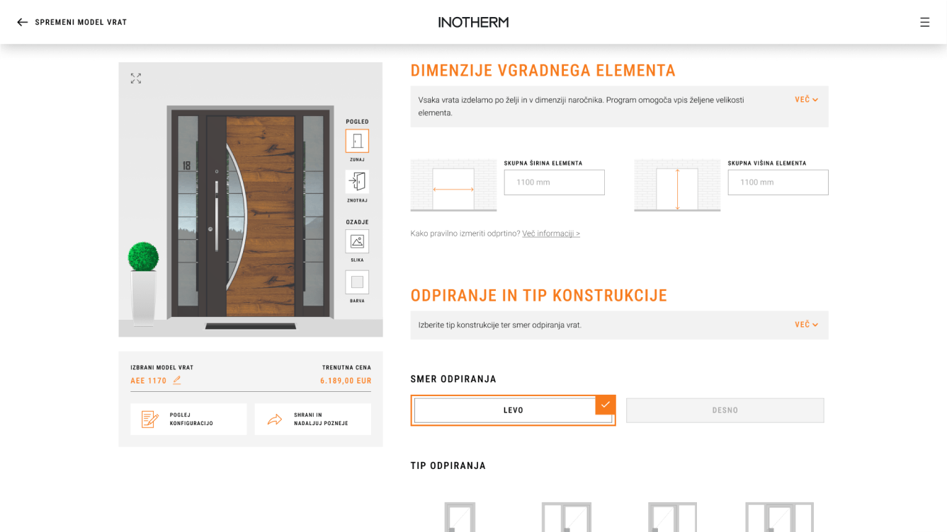
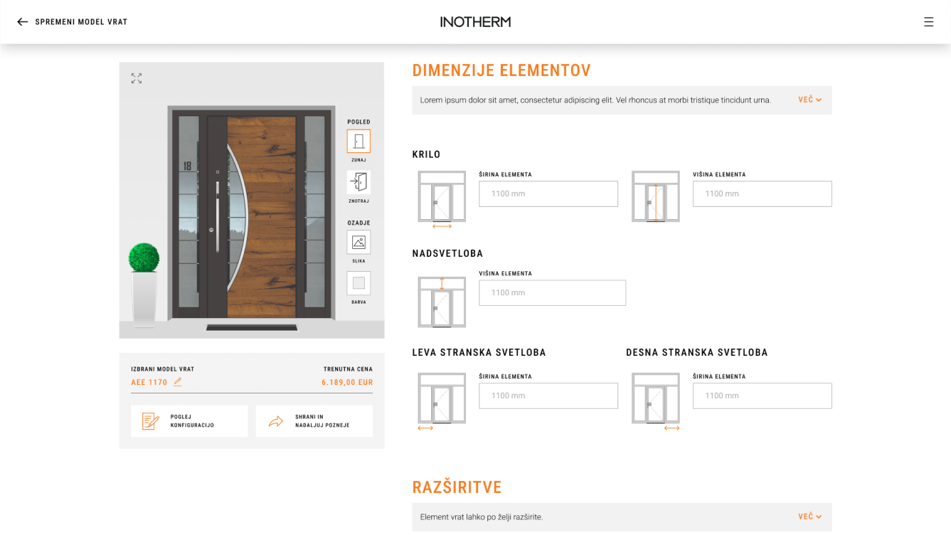
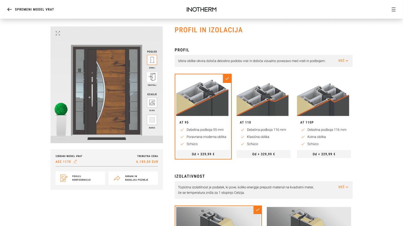
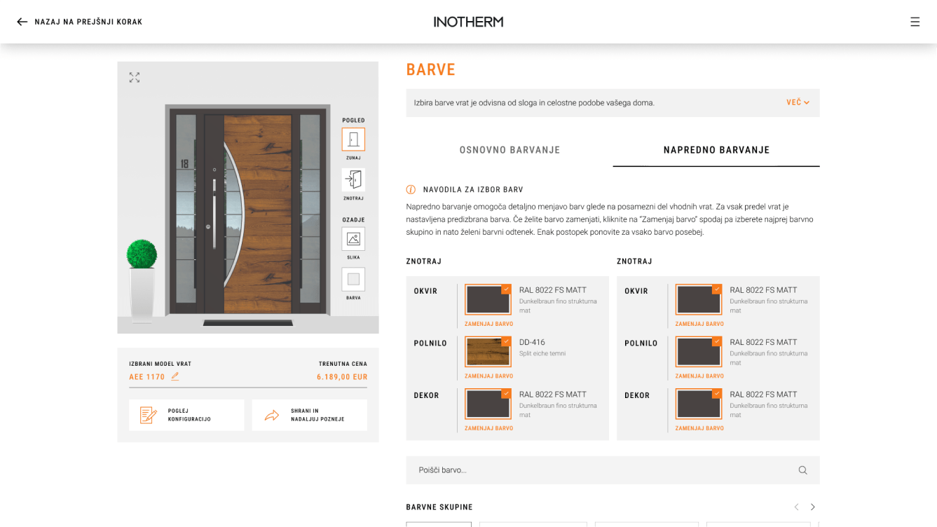
<span data-metadata=""><span data-buffer="">Streamlining door customisation for ease and clarity
Redesigning the entire door configurator presented a significant challenge due to its outdated visual design and complicated user experience. The old configurator required multiple clicks, had confusing information architecture, and was not completely responsive, making it difficult for users to navigate and customize their doors effectively.
The aim of the project was primarily to fully implement a good user experience that would allow the user to easily assemble their unique doors throughout the entire process.
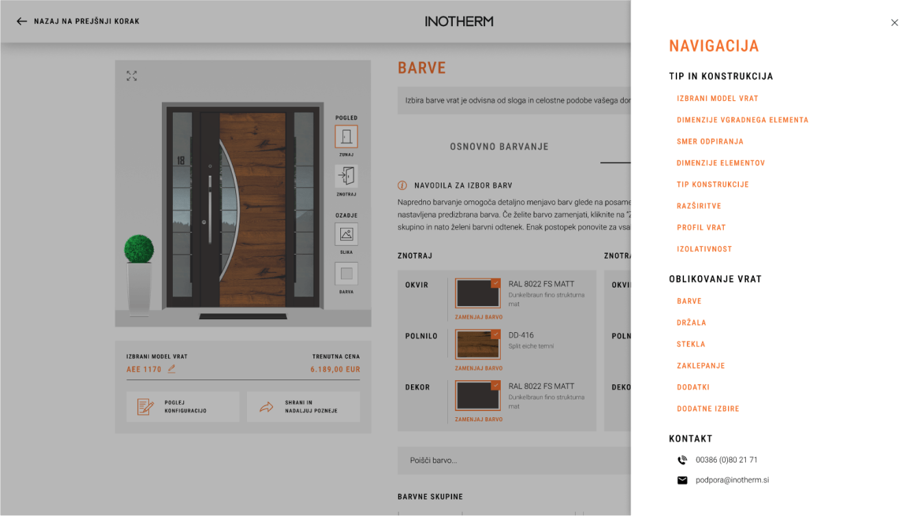
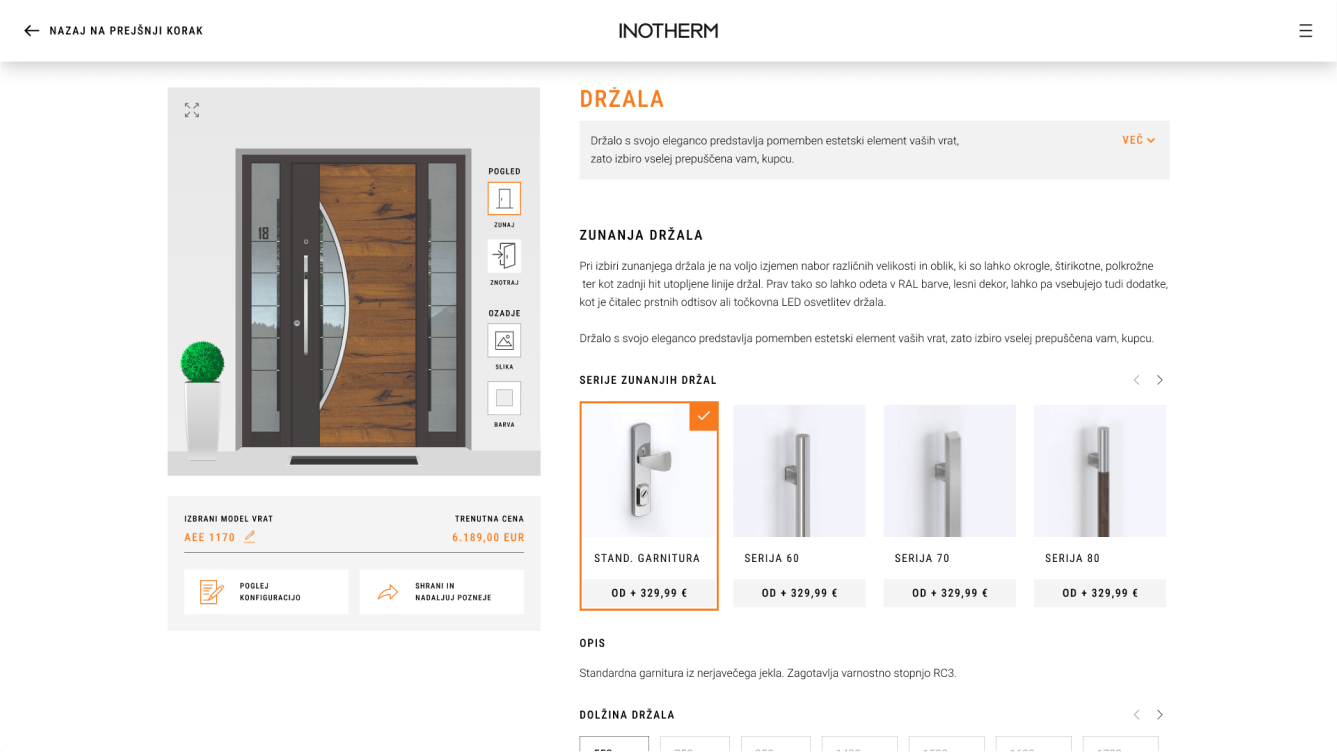
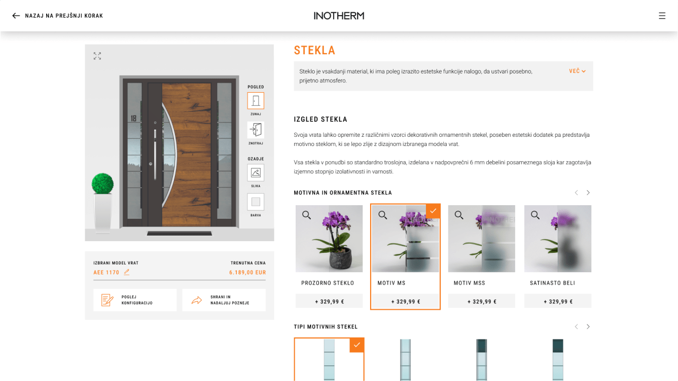
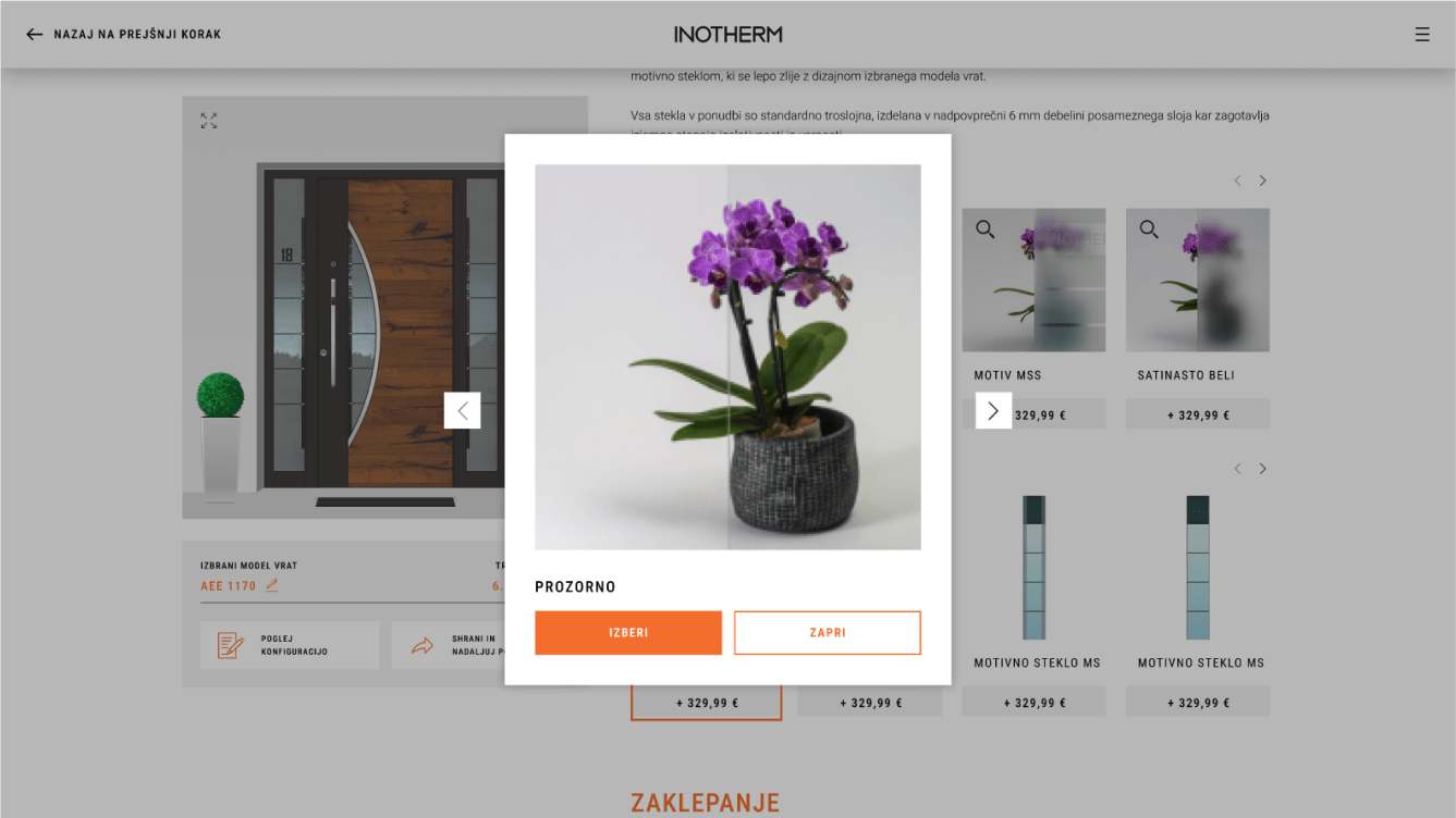
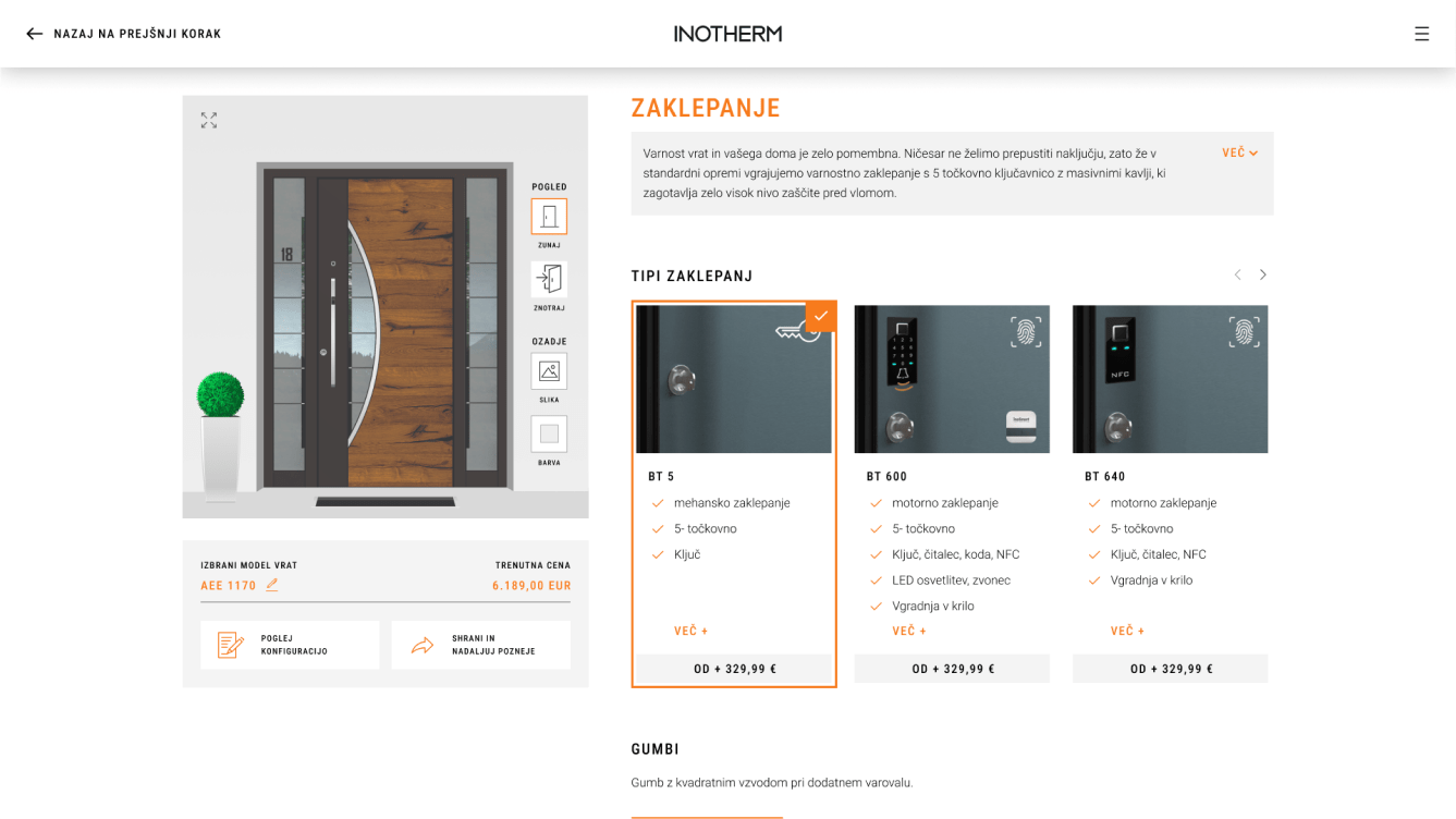
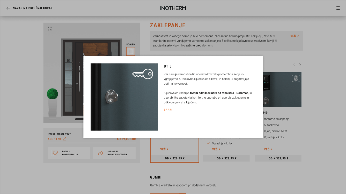
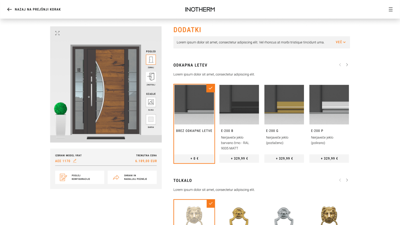
In addition to the user experience, we also paid a lot of attention to the visual appearance of the configurator as well as functionalities that enable the user, for example, to continue the configuration later on another device, and above all, clear selection of individual components with additional explanatory elements.
<span data-metadata=""><span data-buffer="">The whole process of redesigning involved nine distinct steps.<span data-metadata="">
Step 1: Market research and the analysis of existing configurator
For the market research, I conducted thorough user experience (UX) and market analyses. This involved studying user preferences, and pain points through interviews and observation. Additionally, I analyzed competitor configurators, not only within the door industry but also in other sectors like the automotive industry, to gather insights into best practices. To analyze the existing configurator, I examined its user interface, navigation flow, and functionality.
<span data-metadata=""><span data-buffer="">Step 2: Key pain points
Through user research and analysis, we pinpointed areas where users experienced frustration or difficulty in the current configurator. This included issues such as complex navigation, unclear instructions, and a lack of visual guidance during customization. By understanding these pain points, we were able to prioritize improvements that would directly address user needs and enhance the overall user experience.
<span data-metadata=""><span data-buffer="">Step 3: Information architecture<span data-metadata="">
We carefully planned the layout and structure to ensure intuitive navigation and organization of information. This involved mapping out the configurator’s components, creating a list of steps, and designing a logical flow from start to finish.

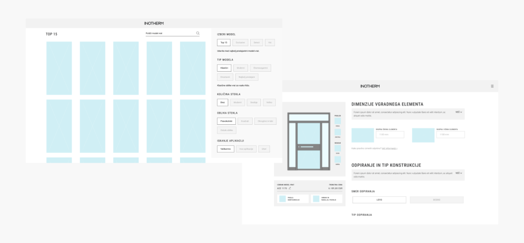
<span data-metadata=""><span data-buffer="">Step 4: Wireframes
Through wireframing we created a clear hierarchy of features and options, ensuring users could easily find what they needed and progress through the customization process seamlessly.
<span data-metadata=""><span data-buffer="">Step 5: Design<span data-metadata="">
UI Styleguide
We developed a comprehensive style guide that outlined the visual elements and design principles for the configurator. This included specifications for colors, typography, iconography, and spacing, ensuring a harmonious and unified look and feel across all components.

#FFFFFF

#E8E8E8

#5B5B5B

#000000

#22A6C6

#F36D2D
Typography


<span data-metadata=""><span data-buffer="">Step 6: Prototyping<span data-metadata="">
Prototyping played a crucial role in the redesign process, allowing us to test and refine the user experience before development. Using Figma, we were able to create prototypes that closely resembled a live, already-launched configurator. This realistic simulation provided stakeholders with a clear vision of the final product and allowed us to gather valuable feedback early in the process.
<span data-metadata=""><span data-buffer="">Step 7: Testing<span data-metadata="">
Through user testing sessions, we invited participants to interact with the prototype while we observed their behaviors and reactions. This hands-on approach provided valuable insights into how users navigated the configurator, identified any usability issues, and validated design decisions.
By observing users in real time, we gained a deeper understanding of their needs and preferences, allowing us to make informed adjustments to the design. This iterative testing process ensured that the final configurator met the diverse needs of our user base and delivered an optimal user experience.
<span data-metadata=""><span data-buffer="">Step 8: Responsive design
Once the desktop version was completed, it became crucial to create a mobile design for the configurator. We approached this by adapting the existing desktop design to smaller screens while ensuring a seamless and intuitive user experience on mobile devices.
This involved optimizing layout, navigation, and interaction elements for touchscreens and smaller viewports. It was important to maintain consistency with the desktop version while tailoring the experience to the unique requirements of mobile users. Through iterative testing and refinement, we ensured that the mobile design delivered the same level of functionality and usability as its desktop counterpart, providing users with a seamless configurator experience across all devices.

<span data-metadata=""><span data-buffer="">Step 9: <span data-metadata=""><span data-buffer="">Dev handoff
Finally, we conducted another round of testing, similar to the earlier stages, to validate the design changes and ensure they addressed any remaining issues. Based on the feedback gathered, we incorporated final corrections and refinements into the design. Once these adjustments were completed, we finalized the design and prepared for the development handoff. This involved creating detailed design specifications and documentation to guide the implementation process for developers.